
| 일 | 월 | 화 | 수 | 목 | 금 | 토 |
|---|---|---|---|---|---|---|
| 1 | 2 | 3 | 4 | 5 | 6 | |
| 7 | 8 | 9 | 10 | 11 | 12 | 13 |
| 14 | 15 | 16 | 17 | 18 | 19 | 20 |
| 21 | 22 | 23 | 24 | 25 | 26 | 27 |
| 28 | 29 | 30 | 31 |
- Kotlin
- dataframe
- GIT
- array
- SQL
- math
- numpy
- c#
- gas
- string
- Google Spreadsheet
- Python
- Apache
- Github
- PySpark
- Java
- PostgreSQL
- Tkinter
- matplotlib
- PANDAS
- Redshift
- Excel
- django
- hive
- Google Excel
- Mac
- list
- google apps script
- 파이썬
- Today
- Total
달나라 노트
Python matplotlib : bar, barh (수평 막대 그래프. 수직 막대 그래프. 막대 그래프 그리기.) 본문
Python matplotlib : bar, barh (수평 막대 그래프. 수직 막대 그래프. 막대 그래프 그리기.)
CosmosProject 2022. 1. 14. 19:19
matplotlib를 이용해서 막대그래프를 그려보겠습니다.
막대 그래프를 그리기 위해선 bar 또는 barh method를 사용하면 됩니다.
bar method는 수직 막대 그래프를 그려주고
barh method는 수평 막대 그래프를 그려줍니다.
import matplotlib.pyplot as plt

list_x = ['2020', '2021', '2022']
list_y = [10, 17, 31]

plt.bar(list_x, list_y)

plt.show()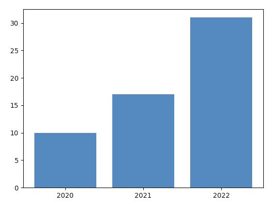
형식은 일반적인 선 그래프와 비슷합니다.
bar method에 x축에 나타낼 값들과 y축에 나타낼 값들을 전달하면 됩니다.
이제 bar method에 적용할 수 있는 여러가지 option들을 알아봅시다.
import matplotlib.pyplot as plt

list_x = ['2020', '2021', '2022']
list_y = [10, 17, 31]

plt.bar(list_x, list_y,
        color='pink')

plt.show()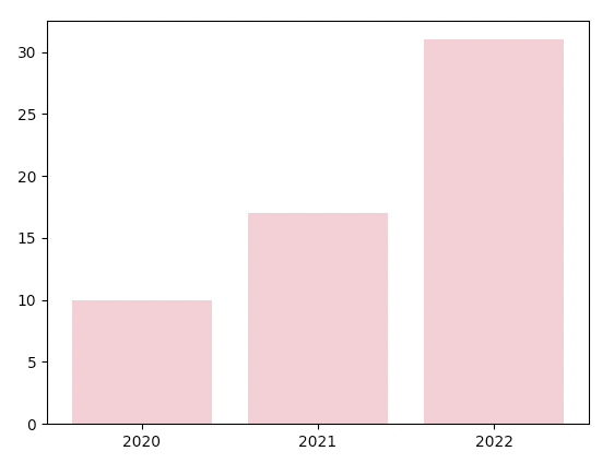
bar method의 color option은 막대 그래프의 막대 색상을 바꿔줍니다.
import matplotlib.pyplot as plt

list_x = ['2020', '2021', '2022']
list_y = [10, 17, 31]

plt.bar(list_x, list_y,
        color=['pink', 'green', 'black'])

plt.show()
color=['pink', 'green', 'black']
위 예시처럼 color 옵션에 list의 형태로 색상을 전달하면 list 속에 있는 색상을 막대에 번갈아가면서 적용해줍니다.
import matplotlib.pyplot as plt

list_x = ['2020', '2021', '2022', '2023', '2024', '2025']
list_y = [10, 17, 31, 37, 45, 48]

plt.bar(list_x, list_y,
        color=['pink', 'green', 'black'])

plt.show()
이처럼 3개의 색상을 각각의 막대에 순차적으로 적용해줍니다.
import matplotlib.pyplot as plt

list_x = ['2020', '2021', '2022', '2023', '2024', '2025']
list_y = [10, 17, 31, 37, 45, 48]

plt.bar(list_x, list_y,
        edgecolor='black', linewidth=10)

plt.show()
edgecolor option은 막대의 테두리 색상을 설정해줍니다.
linewidth option은 막대 테두리의 두께를 설정해줍니다.
import matplotlib.pyplot as plt

list_x = ['2020', '2021', '2022', '2023', '2024', '2025']
list_y = [10, 17, 31, 37, 45, 48]

plt.bar(list_x, list_y,
        width=0.3)

plt.show()
width option은 막대 자체의 두께를 지정해줍니다.
width = 0.3으로 설정해서 막대가 이전 예시들보다 더 얇아졌죠.
import matplotlib.pyplot as plt

list_x = ['2020', '2021', '2022', '2023', '2024', '2025']
list_y = [10, 17, 31, 37, 45, 48]

plt.bar(list_x, list_y,
        width=0.8)

plt.show()
width = 0.8로 설정하니 막대 그래프가 더 두꺼워진 것을 볼 수 있습니다.
이제 수평 막대그래프를 그려봅시다.
거의 모든게 수직 막대그래프를 그릴 떄와 동일하며 bar method대신 barh(bar horizontal) method를 사용하면 됩니다.
import matplotlib.pyplot as plt

list_x = ['2020', '2021', '2022']
list_y = [10, 17, 31]

plt.barh(list_x, list_y)

plt.show()
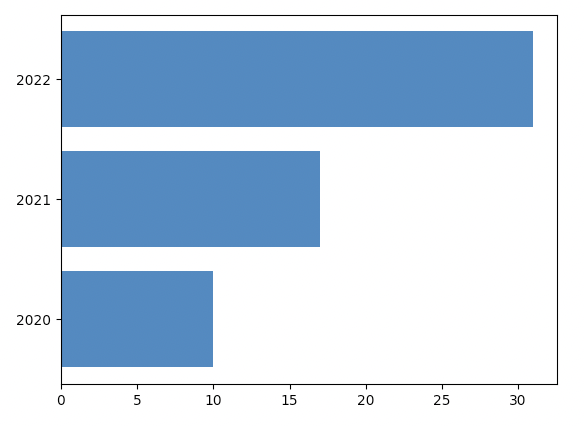
barh method도 동일하게 x축 값과 y축 값을 지정하게 됩니다.
다만 한 가지 주의할 것은 왼쪽 세로축이 x값을 가지게됩니다.
즉, 기존에 x축이 왼쪽 세로축으로 갔다고 보시면 됩니다.
또한 세로 막대 그래프에서 x축 값은 우측으로 갈수록 커지는 형태였다면, 가로 막대 그래프에서는 위쪽으로 갈수록 x값이 커집니다.(2020 -> 2021 -> 2022 이런식)
import matplotlib.pyplot as plt

list_x = ['2020', '2021', '2022']
list_y = [10, 17, 31]

plt.barh(list_x, list_y,
         color='pink')

plt.show()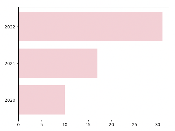
color option은 막대의 색상을 지정해줍니다.
import matplotlib.pyplot as plt

list_x = ['2020', '2021', '2022', '2023', '2024', '2025']
list_y = [10, 17, 31, 37, 45, 48]

plt.barh(list_x, list_y,
         color=['pink', 'green', 'black'])

plt.show()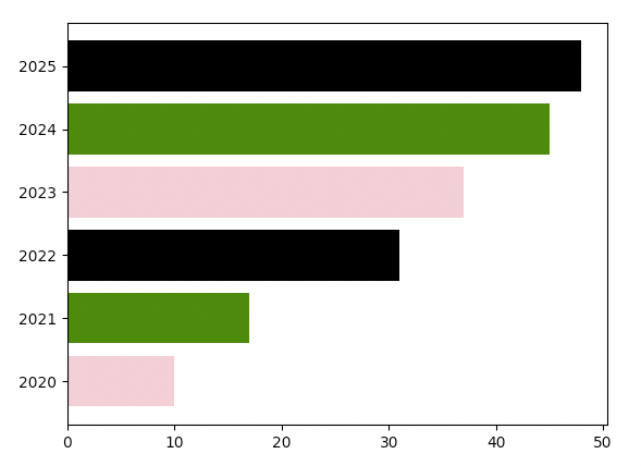
color option을 list의 형태로 전달하면 list 속에 있는 색상을 번갈아가면서 막대에 적용해줍니다.
import matplotlib.pyplot as plt

list_x = ['2020', '2021', '2022', '2023', '2024', '2025']
list_y = [10, 17, 31, 37, 45, 48]

plt.barh(list_x, list_y,
         edgecolor='black', linewidth=10)

plt.show()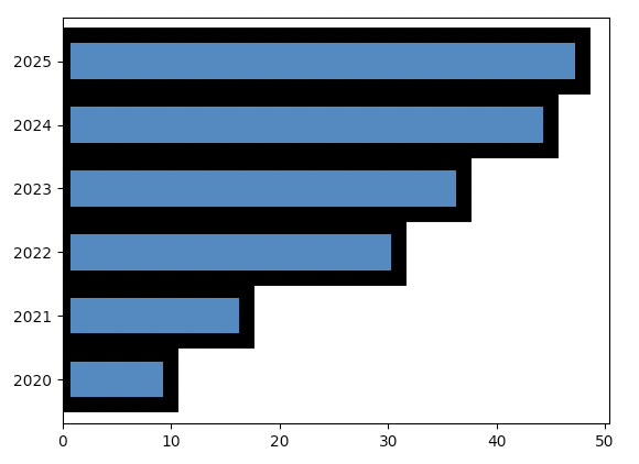
edgecolor option은 막대의 테두리 색상을 지정해줍니다.
linewidth option은 막대 테두리의 두께를 지정해줍니다.
import matplotlib.pyplot as plt

list_x = ['2020', '2021', '2022', '2023', '2024', '2025']
list_y = [10, 17, 31, 37, 45, 48]

plt.barh(list_x, list_y,
         height=0.3)

plt.show()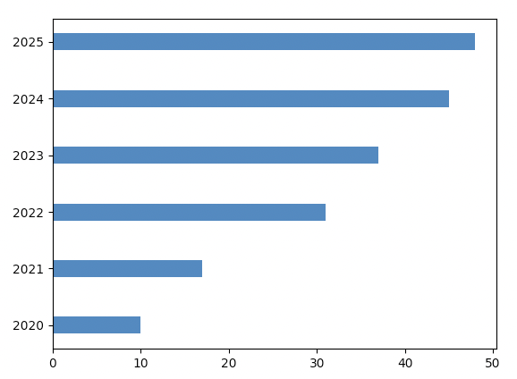
height option은 가로 막대의 높이를 설정해줍니다.
세로 막대는 두께를 width로 설정했는데, 가로 막대의 두께는 그래프에서 봤을 때 세로 두께 즉, 높이가 되므로 height option으로 지정합니다.
다음 코드는 Galton board를 구현해본 코드입니다.

위 이미지처럼 구슬을 위에서부터 떨어뜨리면 구슬은 정규분표(Normal distribution)의 형태로 떨어지죠.
import matplotlib.pyplot as plt
import numpy as np

sample_cnt = 10000

result_max = 17
stair_cnt = result_max - 1

dict_result = {}

for r in range(result_max):
    dict_result[r+1] = 0

for i in range(sample_cnt):
    val_result = (np.min(list(dict_result.keys())) + np.max(list(dict_result.keys()))) / 2

    for s in range(stair_cnt):
        val_prob = np.random.rand()

        if val_prob >= 0.5:
            val_add_factor = 0.5
        elif val_prob < 0.5:
            val_add_factor = -0.5
        else:
            raise Exception('Prob error')

        val_result = val_result + val_add_factor

    dict_result[val_result] = dict_result[val_result] + 1

plt.bar(dict_result.keys(), dict_result.values())
plt.xticks(list(dict_result.keys()))
plt.show()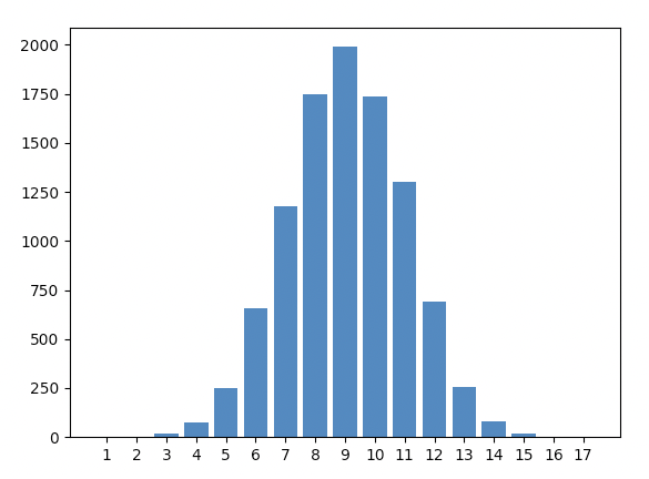
위 코드에서 sample_cnt를 높여주면 더 정규분포에 가까워집니다.
위 코드를 실행할 때 마다 각 x값에 대한 y값이 몇인지는 살짝씩 달라지지만 전체적인 경향성이 정규분포인 것은 달라지지 않습니다.


